Evaluation of a supply side of public transport using GTFS data.
Introduction
The aim of the study is to evaluate a supply side of public transport. The assumption that lies behind this study is that it should minimize the amount of data required and to guarantee its fully replicability. The result is a set of indicators which enable to evaluate public transport network in a given area and easily compare the results between different cities, functional urban areas (FUA) or metropolises, including international comparisons.
The presented example uses an example of Madrid.
Data
Three different types of data are used in the study:
- GTFS (General Transit Feed Specification) which composes of a series of text files with data which contain all information about public transport schedules and associated geographic information.
Data source for an example: Open data from the Consorcio Regional de Transportes de Madrid.
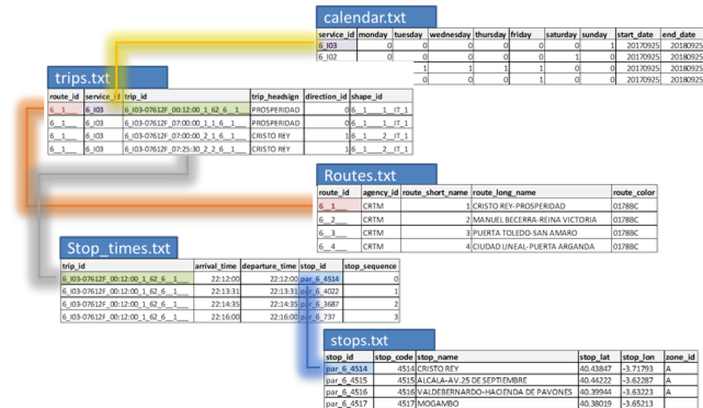
GTFS feed (part)
- Route network derived from OpenStreetMaps
- Data on population distribution: population grids from Eurostat GEOSTAT initiative
Evaluation
The evaluation procedure is divided into three main parts, preceded by an overview of available (or colleced) GTFS data:
- stops location and their accessibility
- frequency of service
- accessibility
Preview
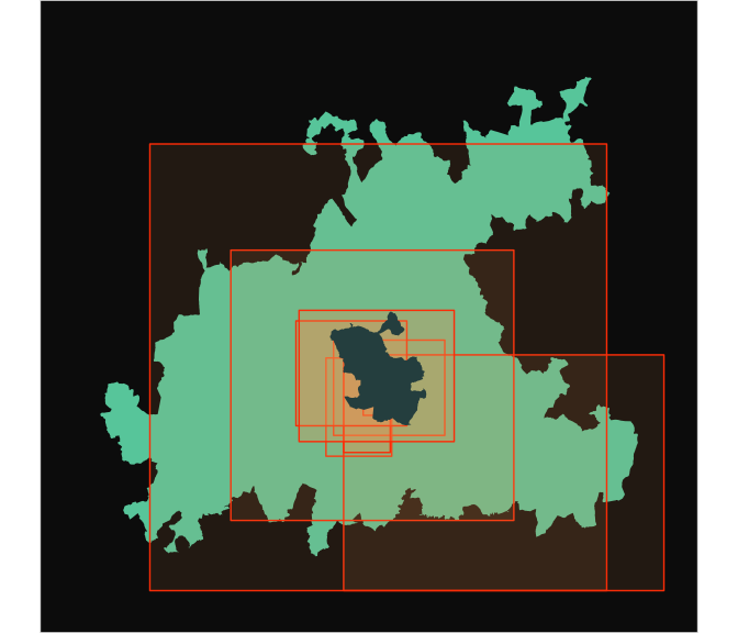
Before the evaluation, there is a need to revise a basic spatial and temporal information about all available feeds for a given case study. A map shows a spatial range of all available GTFS feeds comparing to the city and FUA limits.
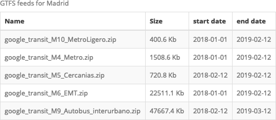
The table provides information about the names and temporal coverages of all feeds in order to confirm that they cover the same period of time. It is also used to select a “typical day” for further analyses (different feeds contain a calendar data coded in a different way, thus a selection of one day is necessary in order to avoid a double-counting of particular trips and/or departures). In this example, based on the data shown in the table, we focus on a “typical working day”: 2018/09/11.
Stops location
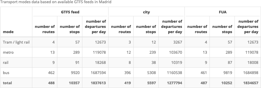
First part of the evaluation focus on a description of public transport network, its spatial pattern and accessibility. The table summarize basic indicators of the network using all available GTFS feeds, providing insights about existing transport modes, number of stops and total number of the departures during the selected day.
Note: due to different systems of coding of calendar, departure times and frequencies. The table provides unified information, regardless:
existence of
frequencies.txtfile - if this file exists, not every departure time is listed instop_times.txt, what needs to be recalculated; this is usually the case of high frequency transport modes, like metro;overlapping calendar data - some datasets code departure time as 25:30:00 (HH:MM:SS, i.e. 01:30:00 + 1 day) which refers to the departure realized the next day in relation to the analysed. If this is the case, there is a need to include part of the departures which are assigned to the previous day than selected for the analysis.
Finally, apart from the division by transport modes, the table summarize differences between the city within its limits, FUA and the whole GTFS dataset(s).
Then, maps visualize distribution of public transport stops in order to analyse their spatial pattern and, e.g. compare a supply of public transport during the day (peak hours) and night (low frequency, limited service).
| city | FUA |
|---|---|
| stops in service during peak hours | |
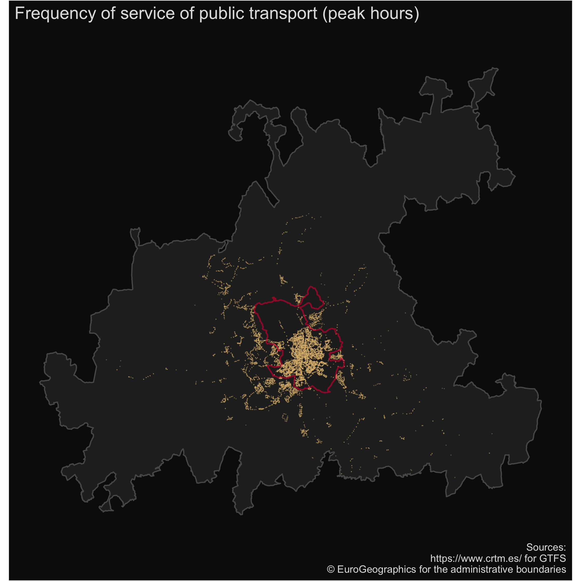 |
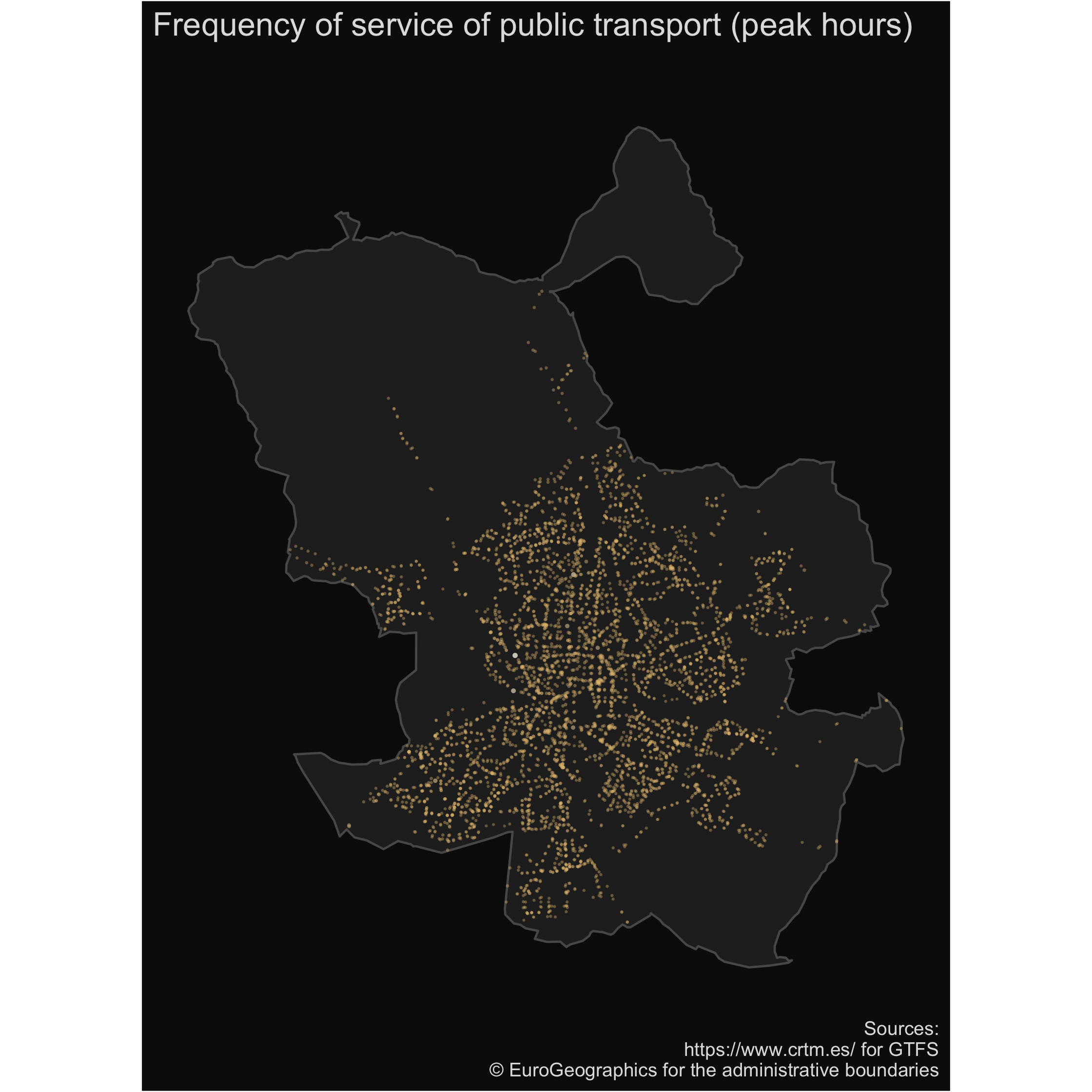 |
| stops in service during a night | |
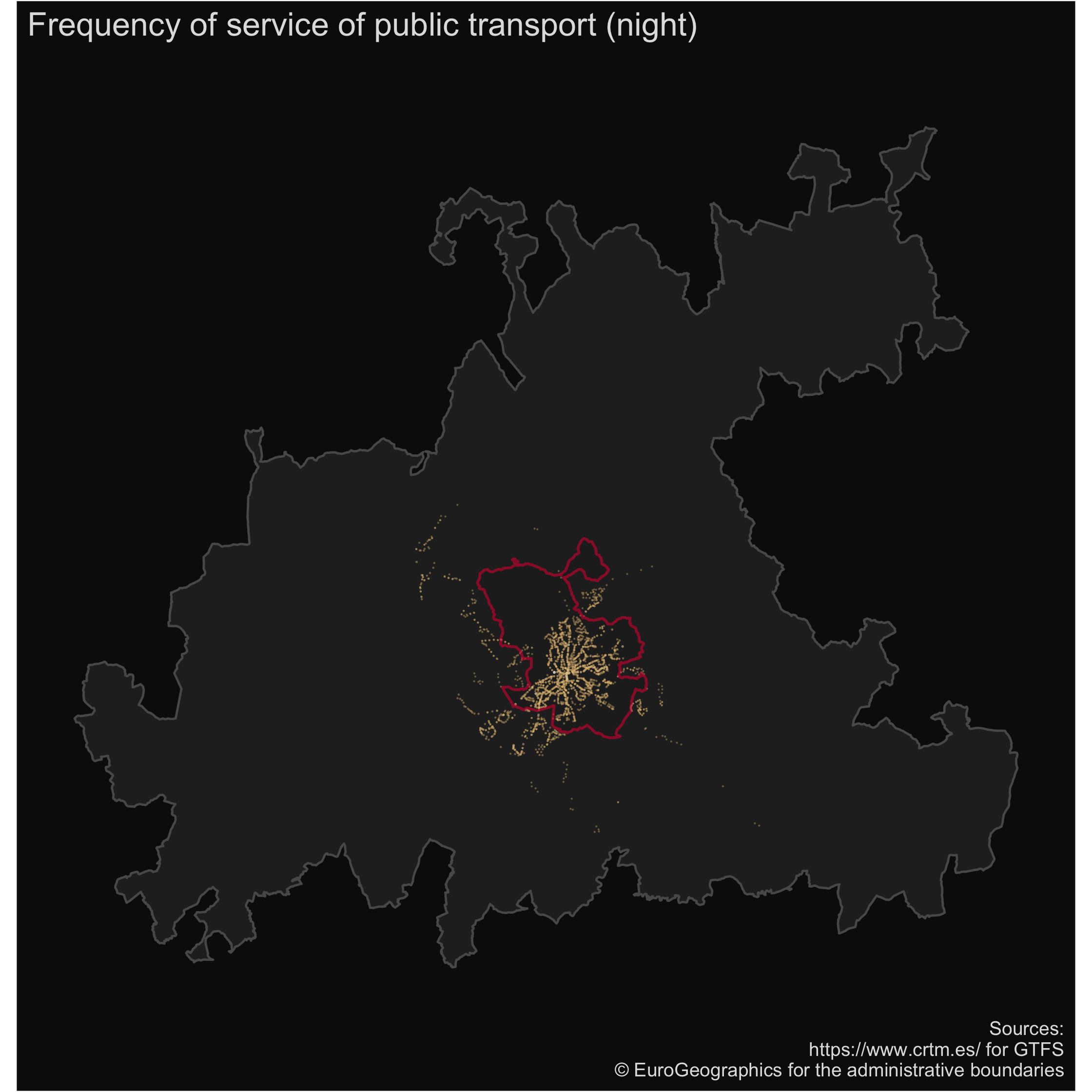 |
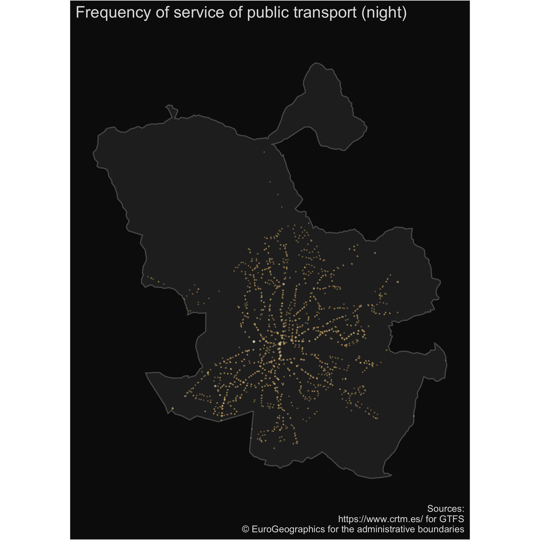 |
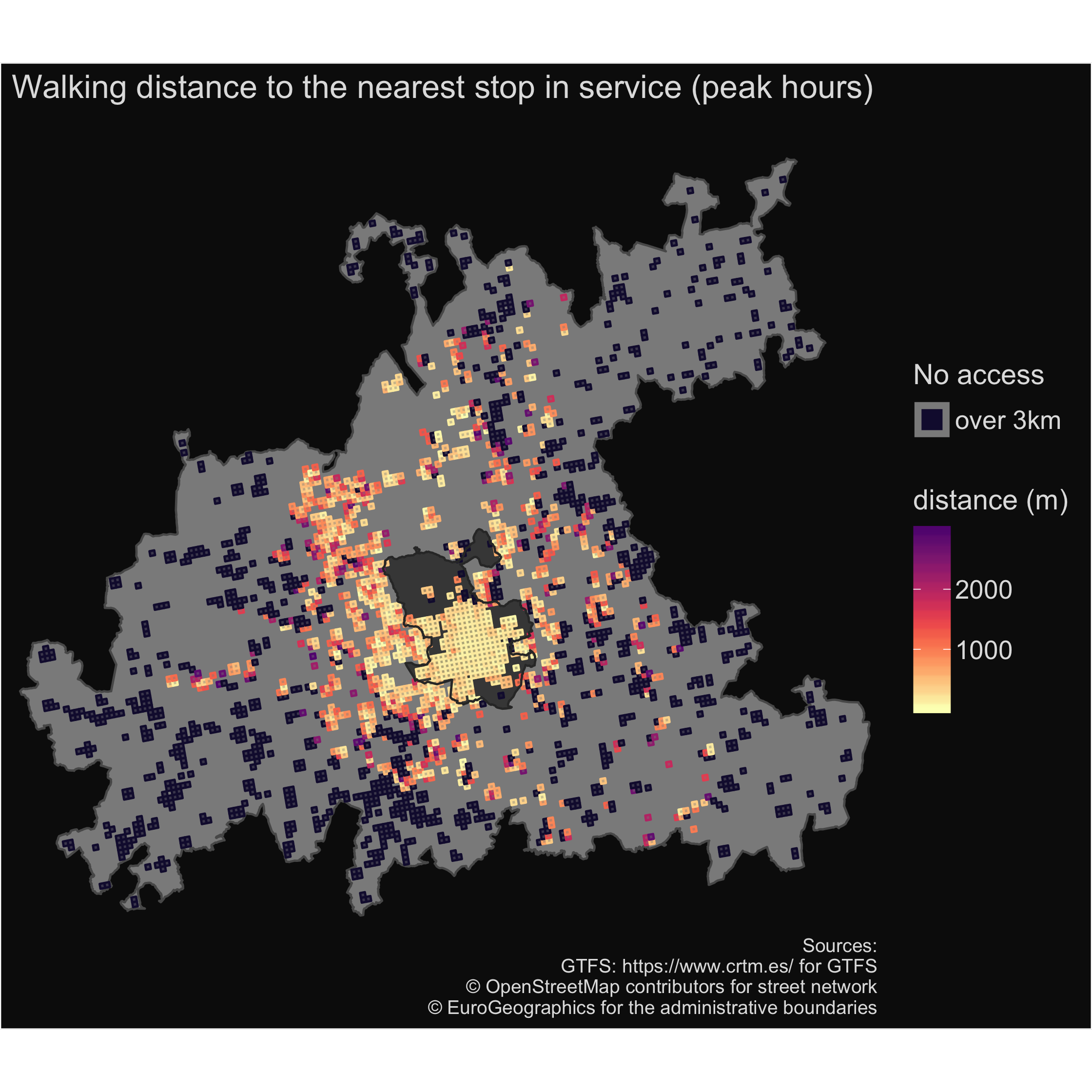
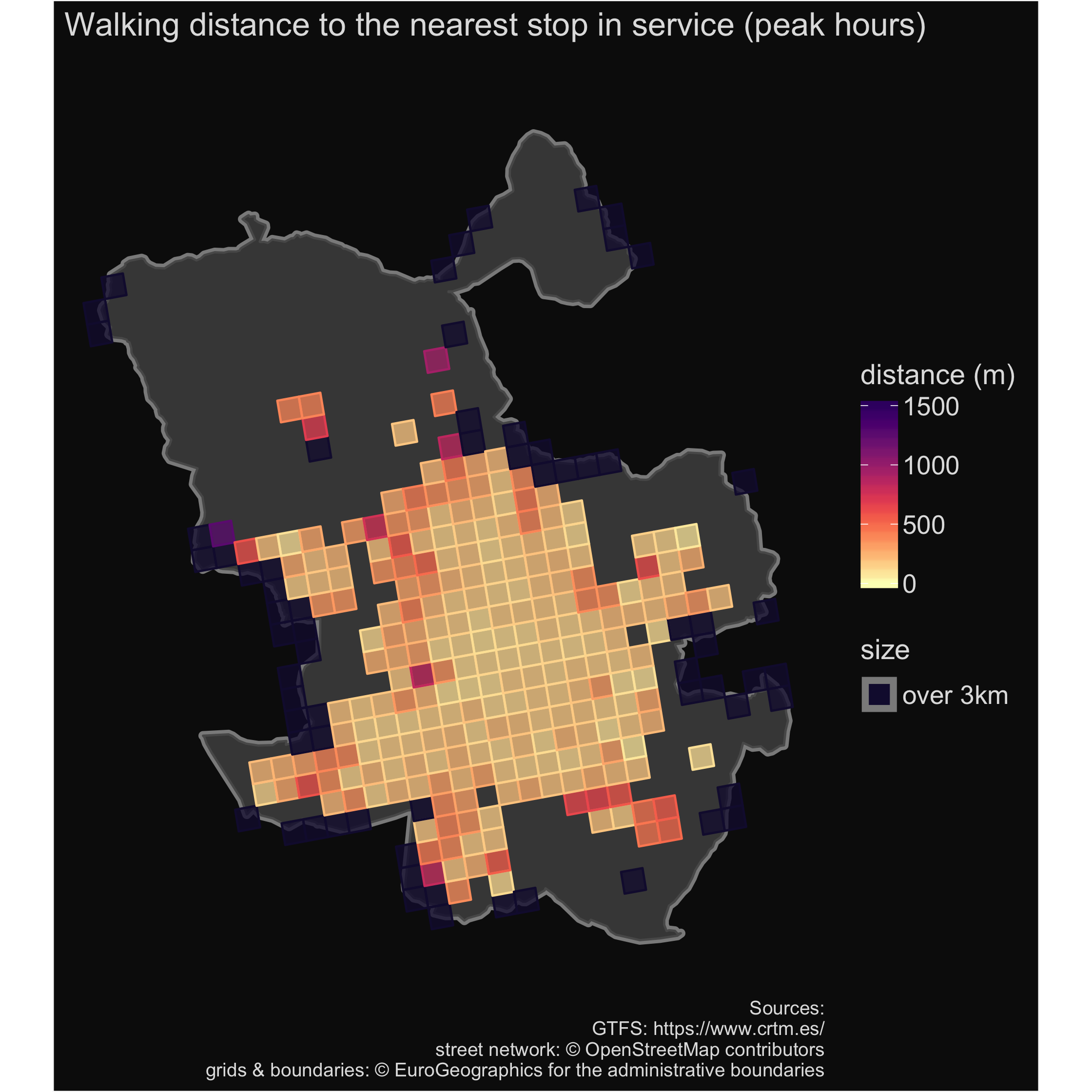
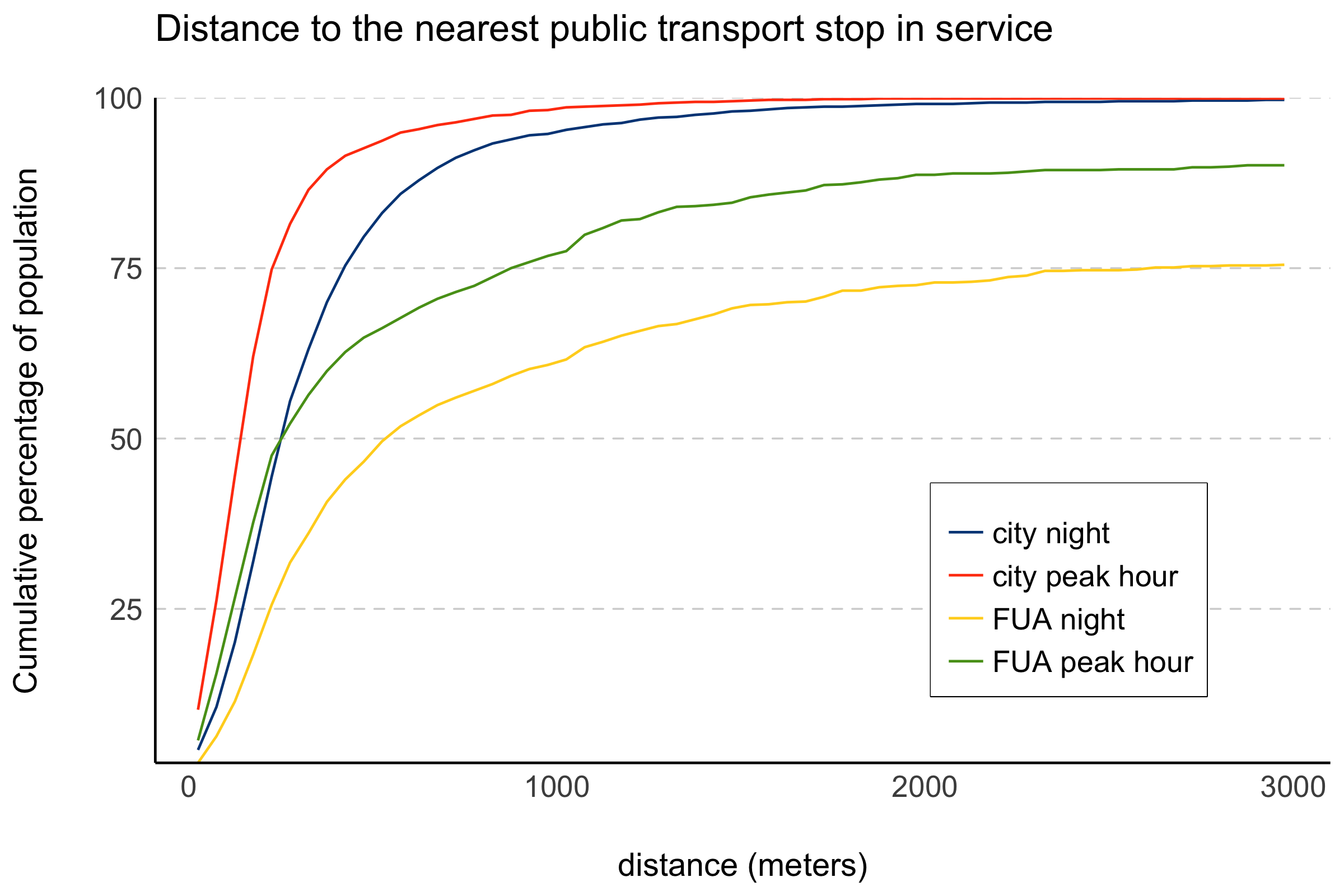
The last part focuses on accessibility to public transport: what is a walking distance to the nearest stop in service? What is a difference between peak hours and night time? What is a difference between the city and its FUA? The next set of maps and graph address these questions.
| city | FUA |
|---|---|
| walking distance to stops in service during peak hours | |
 |
 |
| walking distance to stops during a night | |
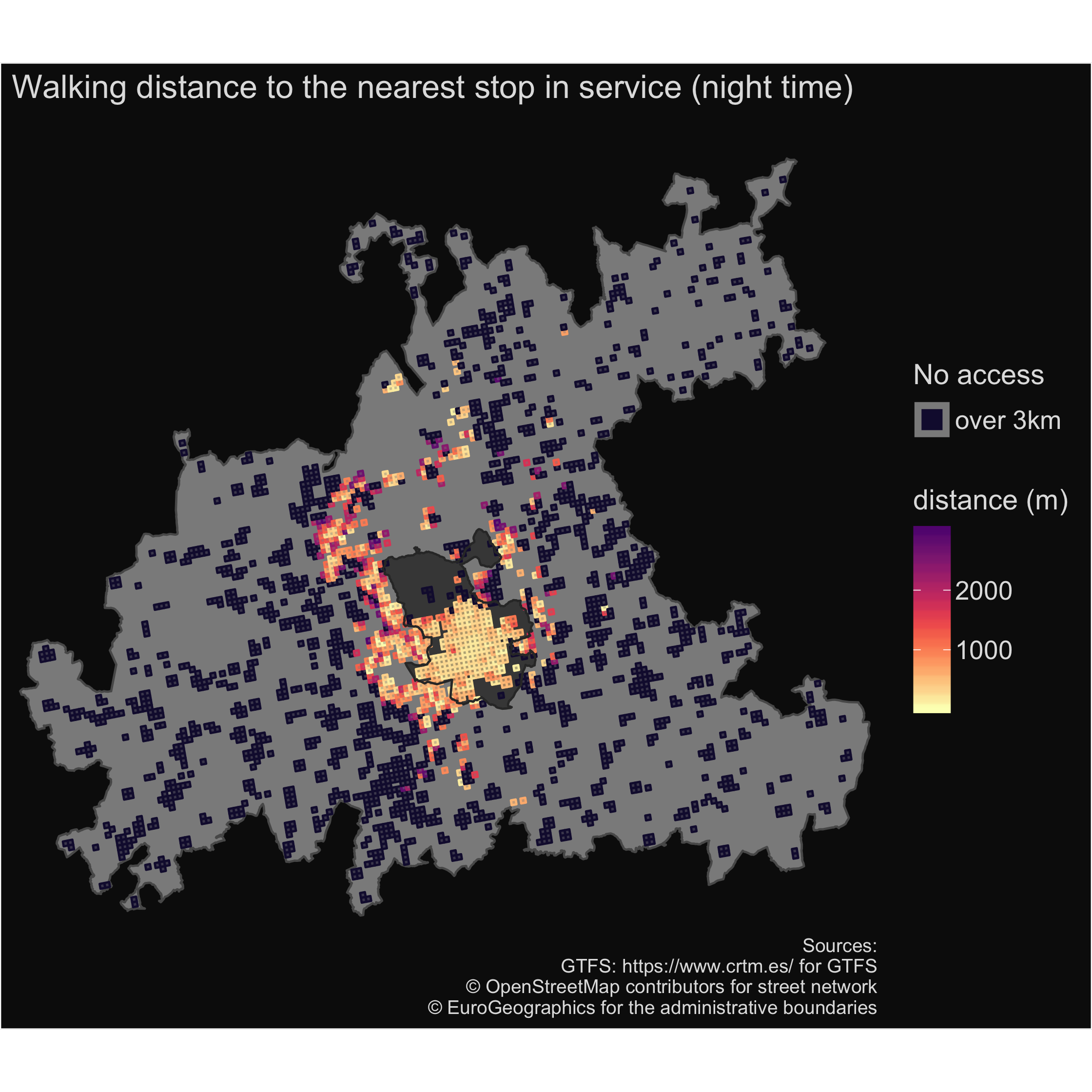 |
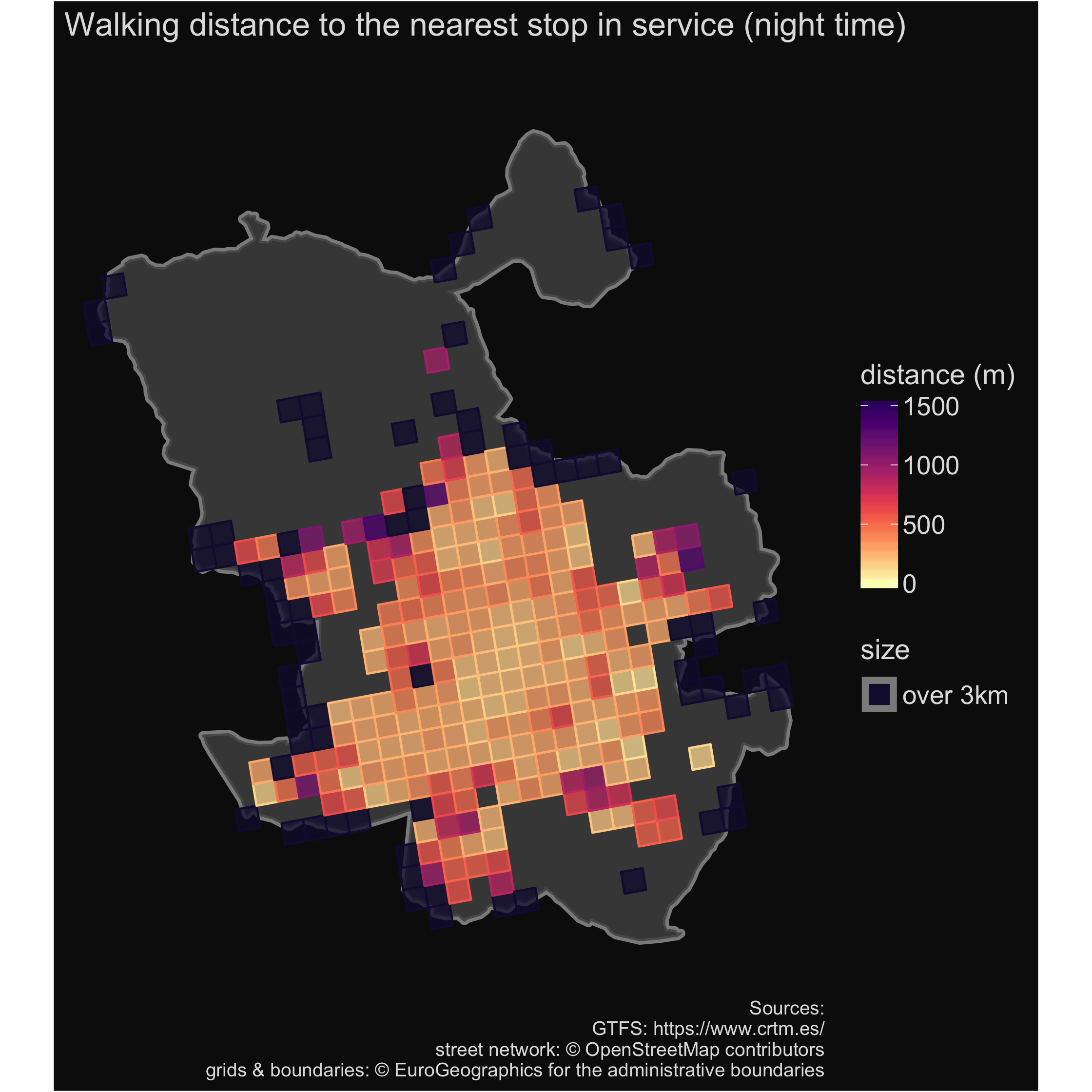 |
Frequency
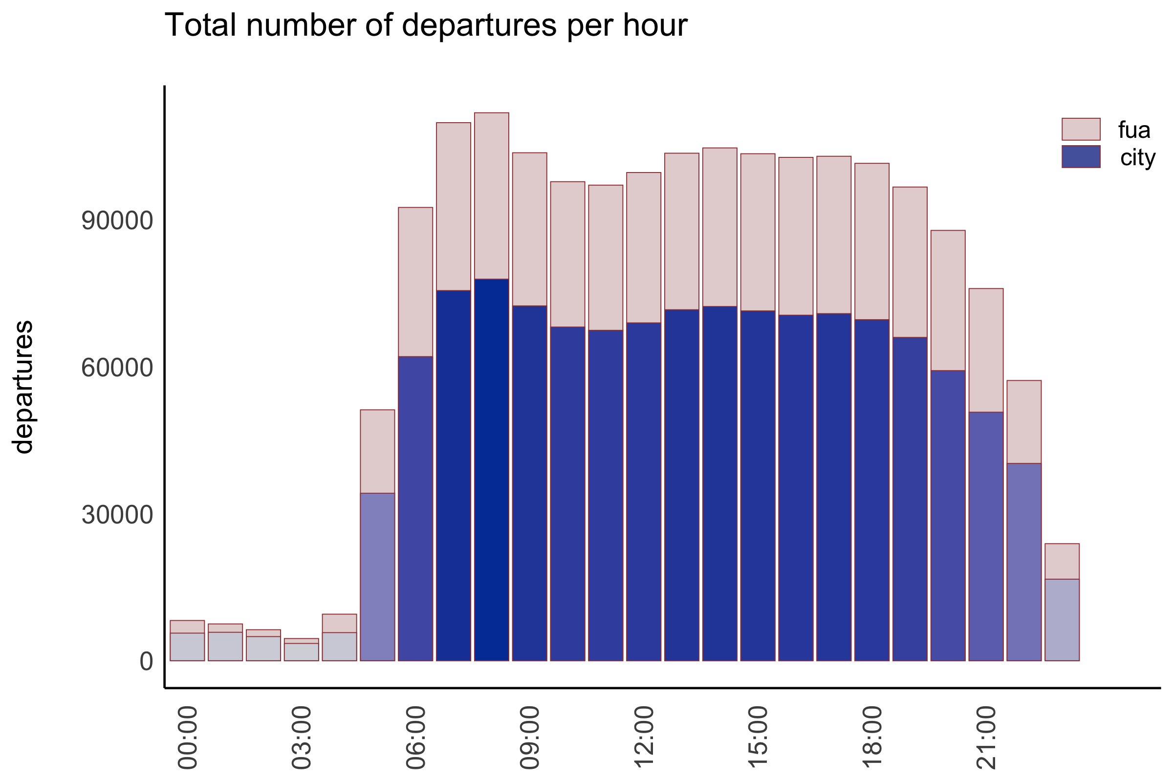
The frequency of public transport differs in a course of a day, in line with peaks and valleys of density of human mobility: more departures take place during peak hours, less in out-of-peak period and much less during the night. Each city or each country has its own curve of daily changes of frequency. Nevertheless, it is important to properly identify periods different frequency, especially, when doing international comparisons. These differences are visualized by the graph presented below. Note, that y-axis shows a total number of departures and not frequency - the latter would be difficult to visualize as there are changes in e.g. number of lines. Moreover, some differences in frequency patterns may occur between a city and its FUA, so both patterns are presented simultaneously. Additionally, it enables to check what share of departures in the all FUA are realized within city limits and how it changes during a day.
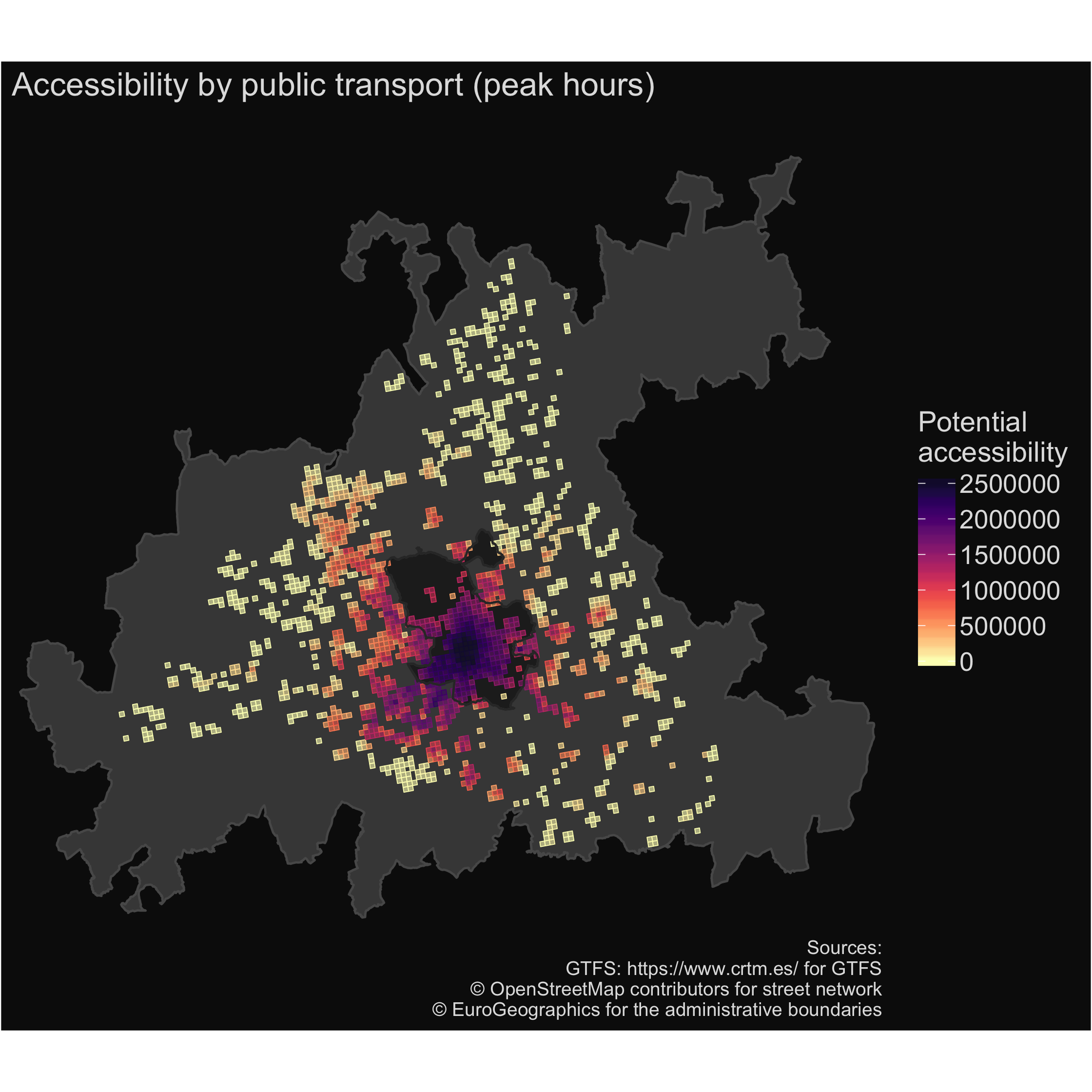
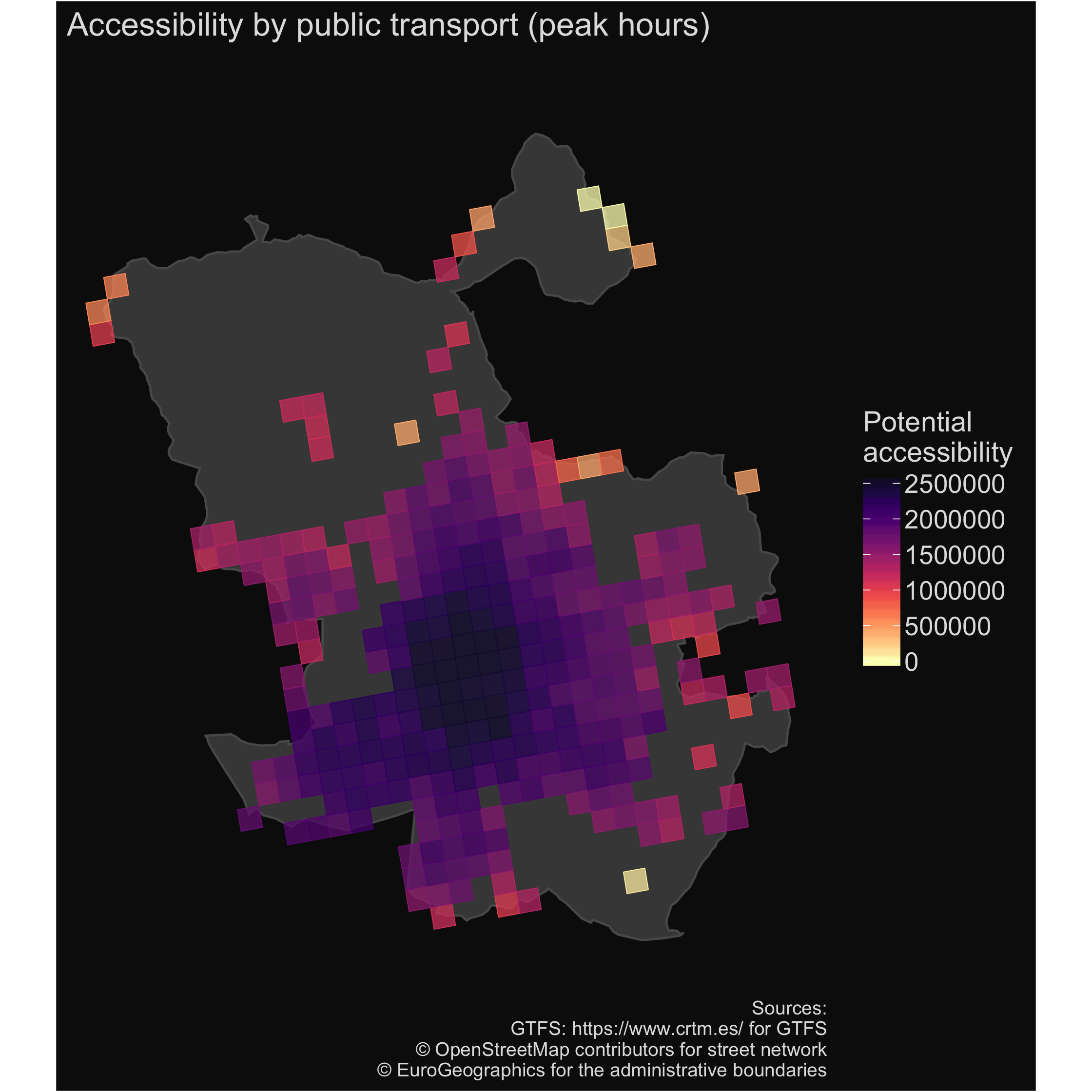
Accessibility by public transport
Regardless the number of stops, lines, departures etc., the most important function of public transport is to enable people to reach their destinations. Thus, the most important indicator which evaluates public transport network is a level of accessibility which offers this network. In this example, a potential accessibility is used, with the number of population as a proxy of destination’s attractiveness. This indicator includes relations between all pairs of origin–destination nodes in a given area and it assumes the greater importance of larger centres than smaller ones and the diminishing attractiveness of more distantly located destinations and it is expressed by the following formula.
$$A_ {i} = \sum_{j}g(M_j)*f{(t_{ij} )} $$
where $A_i$ is a potential accessibility of a zone $i$, $g(M_j)$ is the function of destination attractiveness of a zone $j$ (e.g. number of population1), and $f{(t_{ij} )}$ is a distance decay function. In a given example, a negative exponential is used as distance decay function, with $\beta = 0.0223$ (i.e. a destination loses half-value of its attractiveness at 31 minutes travel time).
1 we use number of population due to the fact that population data are the most broadly available in high resolution datasets.
The results are presented as a set of maps which compare level of accessibility during the day (peak hours) and night and they are presented in a high resolution level of 1km2 grids. Map for FUA are accompanied by zoom-in maps limited to the city area.
| city | FUA |
|---|---|
| accessibility by public transport during peak hours | |
 |
 |
| accessibility by public transport during a night | |
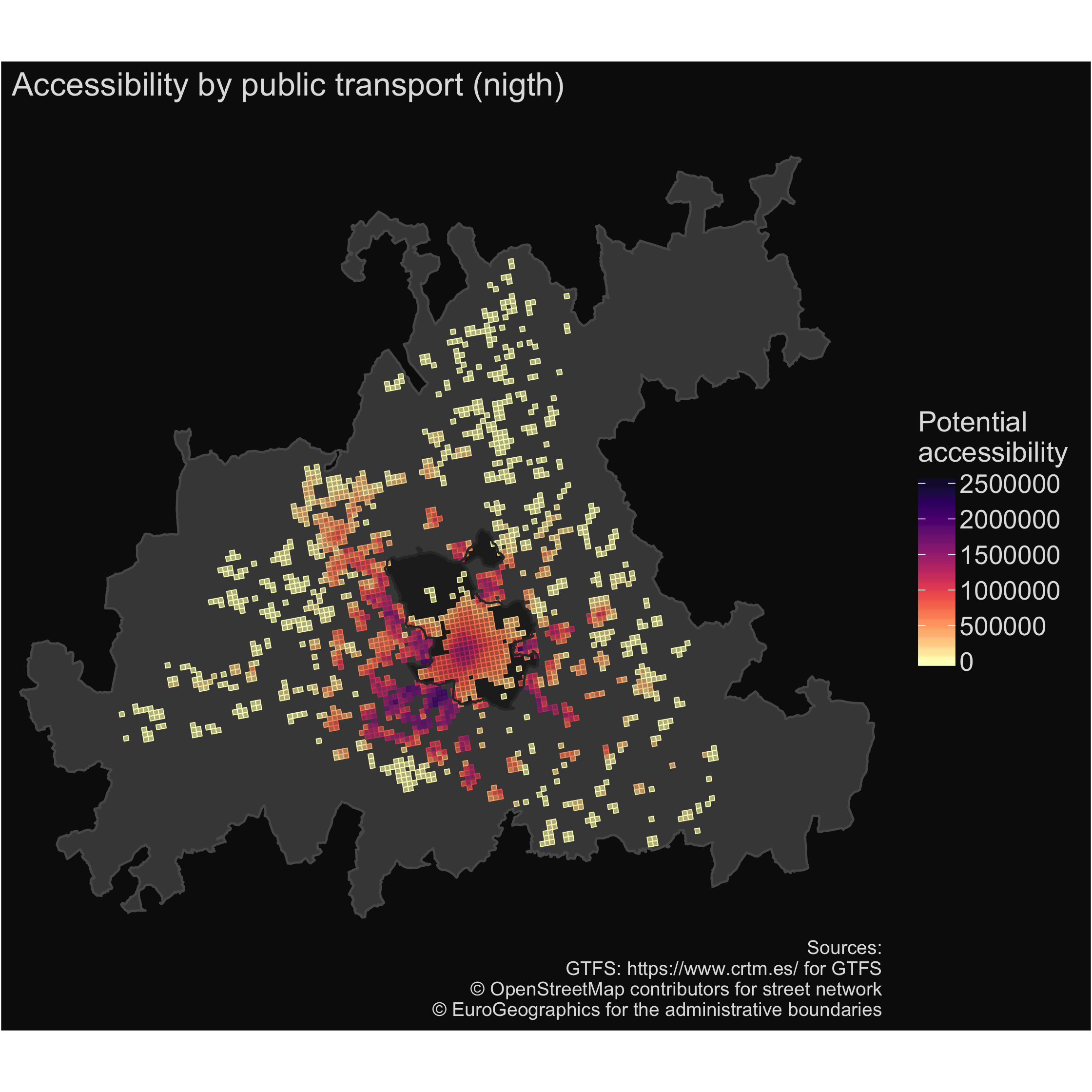 |
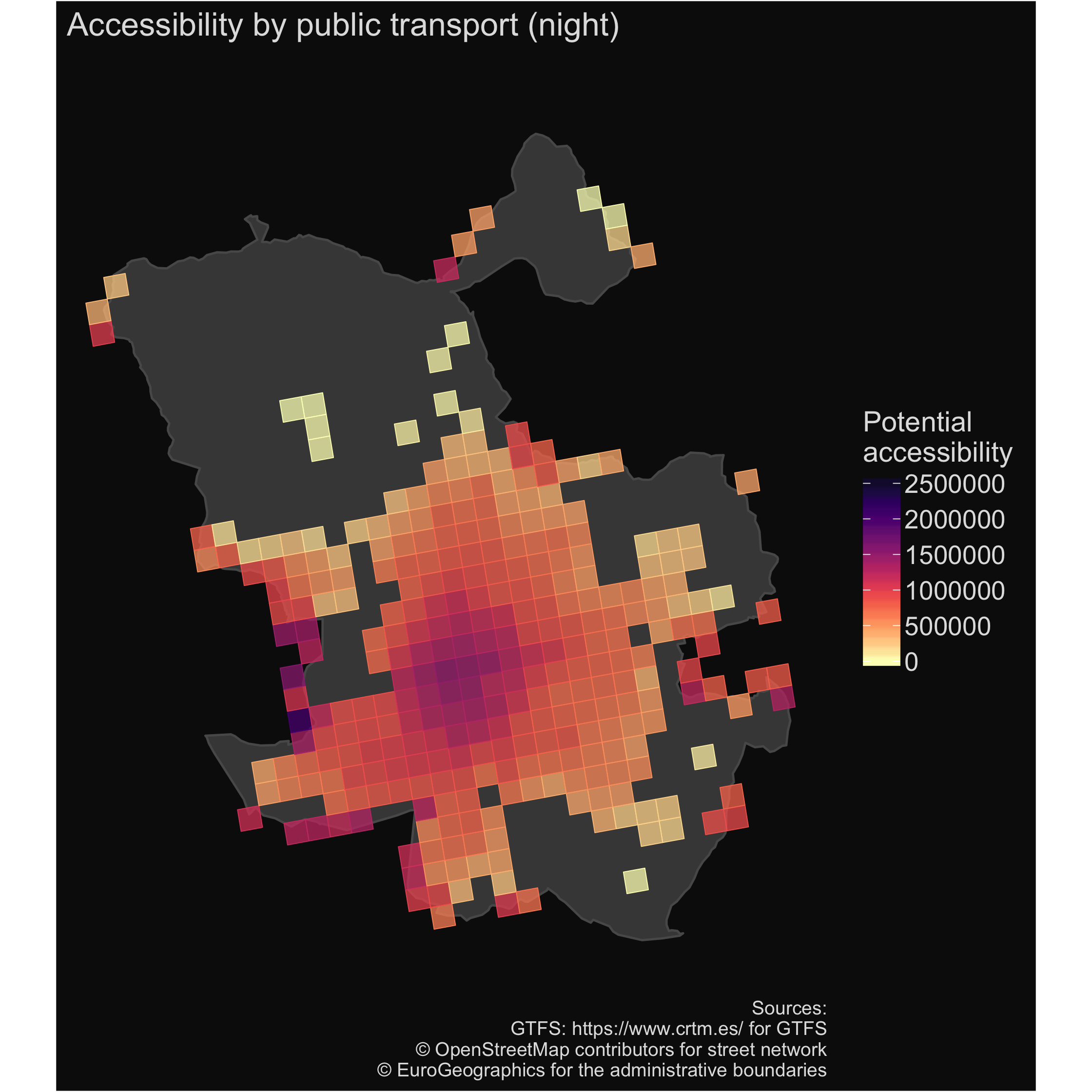 |
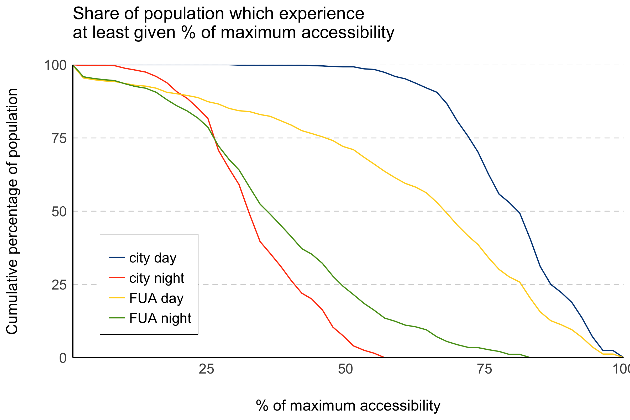
The last graph compares a share of population which has a particular level of accessibility (as a relation to the highest possible value measured in during a day).
Contributors
This study was prepared in collaboration with:
- Chris Jacobs-Crisioni (European Commission, Joint Research Centre)
- David Sousa Vale (University of Lisbon)