Policy support tool for efficient transport policy: using temporal sensitive transport data to identify main accessibility restrictions.
Introduction
The main aim of the study is to prepare a methodological guidelines and describe data needs related to the evaluation of an impact of particular transport related restrictions of accessibility at the level of the whole city or metropolitan area (global restrictions) and spatial pattern of their distribution (local restrictions). The results of the analyses enable to identify main causes of the limited accessibility in a given area which in turn can be used as a base of the strategic decisions leading towards more efficient transport system.
The study extensively uses a potential of new, temporally sensitive data sources and methods which incorporate a temporal variability into the accessibility analysis. New data facilitates to compare accessibility by different transport modes (e.g. public transport and private car), as well as to identify different factors affecting spatial patterns of accessibility, including geography, quality of transport network and congestion levels and organization of public transport, including its routing, frequencies and timing.
The bottom line of the study is to apply a comparative approach in order to detect main reasons that limit accessibility level in particular areas. We compute travel times by private car using free flow and congested speeds, and we calculate travel times by public transport with a fine temporal resolution, applying a schedule-based, public transport data (GTFS format). Additionally, we prepare a pseudo-GTFS dataset, transforming the original GTFS feeds in a way that we exclude any waiting time from the model, i.e. travel time includes only in-vehicle time (or times in case of transfers) and walking to, from (i.e. from origin to stop and from the final stop to the destination) and between public transport stops (in case of transfers).
The presented document uses Madrid as a case study and focuses on accessibility to jobs during the morning peak hours (i.e. 7-10am). However, depending on particular needs and availability of data, jobs might be replaced by any other type of destination.
Data
The main characteristic of the tool are small data requirements. In fact it requires three types of data:
- road network data which permits to calculate travel time with free flow and congested speeds;
- GTFS feed in order to calculate travel time by public transport (for the details consult GTFS study);
- data for the origin-destinations zones
Ad. 1. In the presented example of the application of the tool the TomTom® Speed Profiles are used in order to prepare origin-destination matrices with free flow and congested speeds. However, Speed Profiles can be replaced by another (similar) data (e.g. OpenStreetMaps, HERE Traffic, TravelTime Platform or Inrix Traffic, among others).
Speed Profiles is a network dataset, where a particular edge of the network (i.e. road segment) contains a very precise information about an average travel speed, depending on: day of the week and hour with 5-minute temporal resolution. The graph below presents a relative change of speed during the course of the day (typical working day) with 100 equal to a free flow speed of a particular road segment. The graph presents a shape of curves of almost 300 different “speed profiles”.

Figure: Speed Profiles
Ad. 2. GTFS feeds used for this example are provided by Consorcio Regional de Transportes de Madrid.
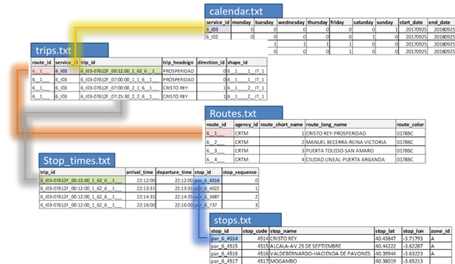
Figure: Structure of GTFS feed (sample)
Apart from real GTFS feed a pseudo-GTFS is required in order to evaluate an impact of route network (routing scheme) on accessibility level. The pseudo-GTFS is a public transport network dataset with no waiting times included (i.e. door-to-door travel time is equal to in-vehicle and walking to/from/between stops).
Ad. 3. This example focuses on accessibility to jobs and it uses number of jobs as a proxy of destination attractiveness. The data are provided by Instituto de Estadistica de Comunidad de Madrid. Additionally the population number per zone is used in order to: (1) remove areas of low population density from the analysis, and (2) to calculate weighted averages of accessibility level at the city level.
Data preparation and preliminary analysis
Preparation of Origin-Destination matrices
The input data for the the analysis are several origin-destination matrices (OD matrices) for a particular transport mode. As travel time by public transport highly depends on the departure time (as it affects waiting times, transfer times etc.) in case of public transport there are several OD matrices, one for each of the departure times. Based on the previous study we use a hybrid sampling method and 5-minute temporal resolution, in order to reduce an impact of temporal resolution on travel time measurement. In result, we use 36 OD matrices which are then aggregated in order to obtain:
- average travel time (using a hybrid-based average, for the details see: Stępniak and Jacobs-Crisoni, 2017)
- minimum travel time in order to prepare a “best-case scenario” (the highest possible accessibility level of a given area during the morning peak hours).
- maximum travel time in order to prepare a “worst-case scenario”
The last two are used to o evaluate an impact of public transport schedule on accessibility level, i.e. to what extent the fact that one can (or cannot) freely select their departure time affects the level of accessibility they experience.
In case of private car accessibility, two matrices are required: one for flee flow speeds and one for congested speeds. In case of availability of more temporally detailed data (i.e. several OD matrices for different departure times, e.g. every 15 minutes), the minimum and maximum travel time may be prepared, as it is done in case of public transport. Nevertheless, the variability of travel time by car is more regular and smooth, thus this information is only a supplementary one.
In result the number of OD matrices is limited to eight: four for public transport and four for private car travel times.
Accessibility calculation
In the second step, the accessibility values for each of the scenarios are calculated. In this case a potential accessibility measure is used:
`$$A_ {i} = \sum_{j}g(M_j)*f{(t_{ij} )} $$
where $ A_i $ is a potential accessibility of a zone $ i $, $ g(M_j) $ is the function of destination attractiveness of a zone $ j $ (e.g. number of job), and $ f{(t_{ij} )} $ is a distance decay function. In a given example, a negative exponential is used as distance decay function, with $ \beta = 0.0223 $ (i.e. a destination loses half-value of its attractiveness at 31 minutes travel time).
Additionally, the coefficient of variation is calculated as it facilitates to evaluate a variability of travel time on accessibility level (only for public transport accessibility).
| Scenario Abbreviation | Description | Comment |
|---|---|---|
| Car accessibility | ||
| FreeFlow | Free flow speed | Benchmark scenario |
| Car_Best | Car best-case scenario | Congestion |
| Car_Avg | Average car | Congestion |
| Car_Worst | Car worst-case scenario | Congestion |
| Public transport accessibility | ||
| FullFreq | PT - no waiting time | PT route network |
| PT_Best | PT best-case scenario | Frequency of PT |
| PT_Avg | Average PT | Frequency of PT |
| PT_Worst | PT worst-case scenario | Frequency of PT |
| PT_VarCoeff | Coefficient of variation of PT accessibility | variability of PT accessibility |
The dataset which contains all the data above can be found in the project open data repository.
Spatial pattern of accessibility
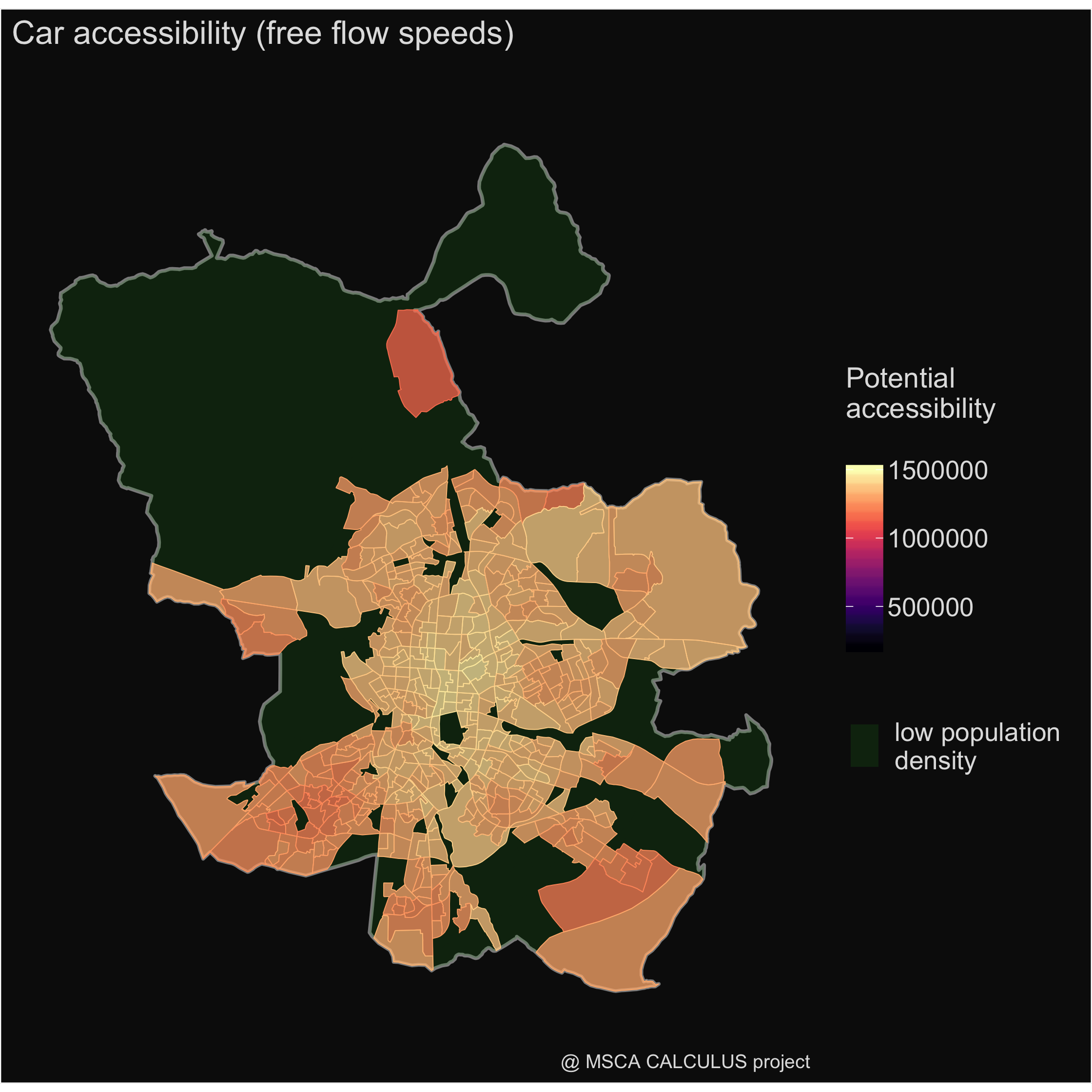
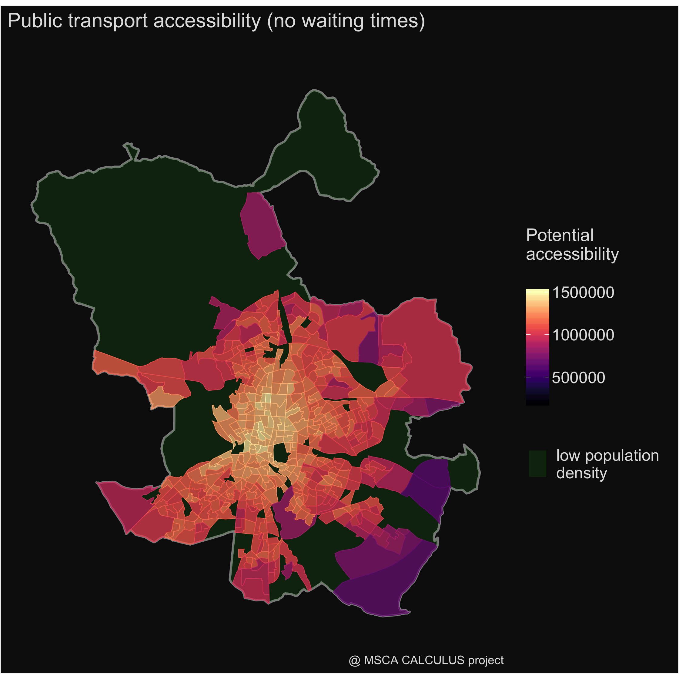
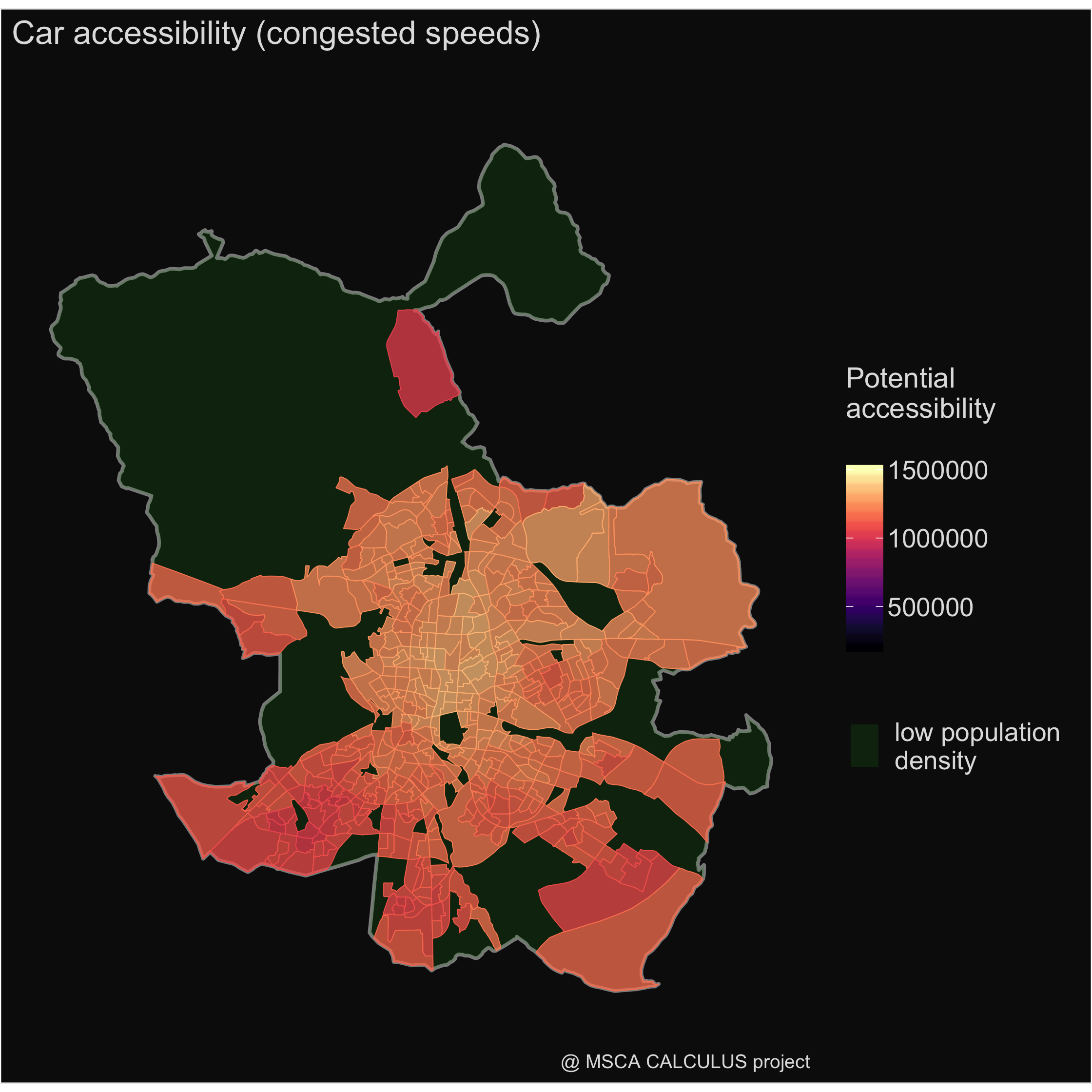
Once accessibility values are calculated, we can focus on preliminary analysis of spatial patterns of accessibility in particular scenarios. Four of them are particularly important from the policy perspective: accessibility by car with free flow speeds, accessibility by car with congested speeds, accessibility by public transport in no-waiting-times scenario and average accessibility by public transport. In order to facilitate comparison of maps, all of them follow the same color palette and breaks.
| accessibility by car | accessibility by public transport |
|---|---|
 |
 |
 |
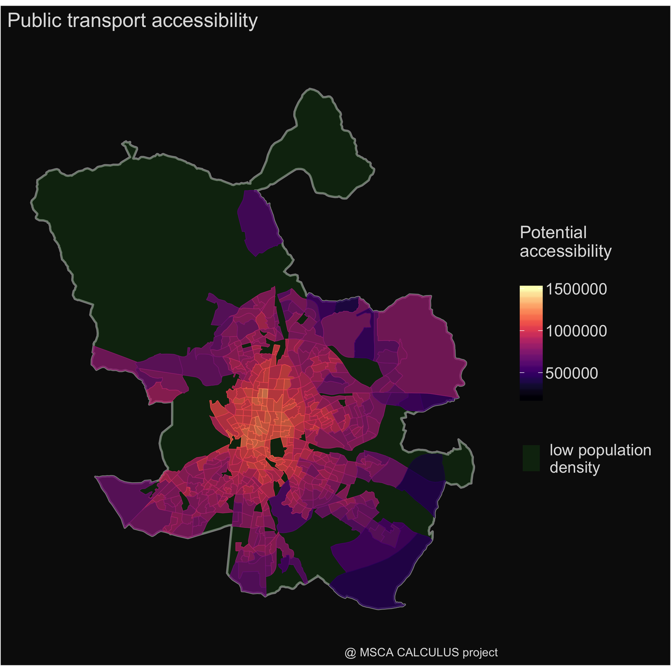 |
The preliminary analysis of spatial patterns of accessibility enable to identify main regularities in spatial distribution of accessibility level. First, it seems that all of them follow the same central-periphery division. However, some irregularities as well as differences between scenarios can be found. In case of congestion, there is a difference between south and north (and south-west in particular), while in case of public transport we can find a star-shape pattern, along the rail links. Moreover, one can find a strong difference in accessibility level between car and public transport scenarios. The next section focuses on these general differences.
Accessibility restrictions at city scale
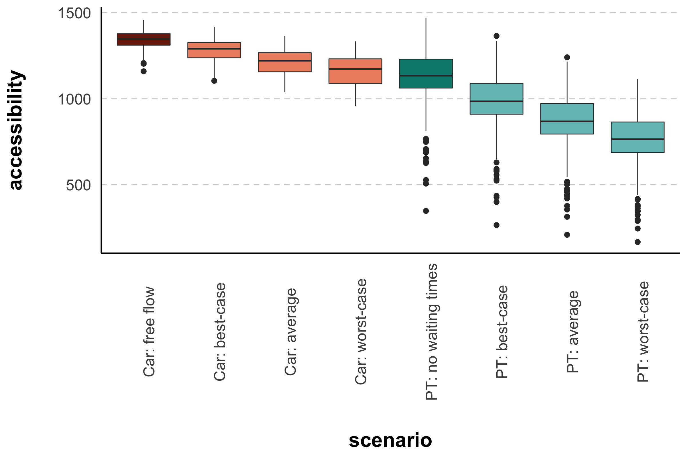
The aim of this section is to facilitate a general comparison accessibility values in different scenarios and detect the main factors which limits accessibility at the city (metropolitan) level. The box-plot shows a general distribution of accessibility level, while table focuses on relative differences, but it additionally uses population weighted averages in order to reflect the extend to which observed differences affect inhabitants.
Speed Profiles
First, we can see that accessibility in all car scenarios are higher than in public transport ones. The exception is made only for not realistic scenario with no-waiting times, which is slightly higher than the most congested scenario. Second, the impact of congestion is less significant (less than 10%) than impact of change of transport mode (~25%). Finally, selection of a particular departure time is more important in case of travel by public transport than in case of car trips (difference between best and worst case scenarios: 90.7% vs 78.1%). This shows that those who travel by public transport have to larger extent adapt their daily schedule to public transport schedule than car traveler to the traffic conditions (congestion).
| scenario | Free flow | Best | Average | Worst | no waiting times | Best | Average |
|---|---|---|---|---|---|---|---|
| Car Best case | 95.4 | ||||||
| Car Average | 90.3 | 94.6 | |||||
| Car Worst case | 86.5 | 90.7 | 95.8 | ||||
| PT no waiting times | 87.1 | 91.3 | 96.6 | 100.9 | |||
| PT Best case | 76.5 | 80.2 | 84.8 | 88.5 | 87.7 | ||
| PT Average | 68.0 | 71.2 | 75.3 | 78.6 | 77.8 | 88.7 | |
| PT Worst case | 59.9 | 62.7 | 66.3 | 69.2 | 68.5 | 78.1 | 87.9 |
Accessibility restrictions at local scale
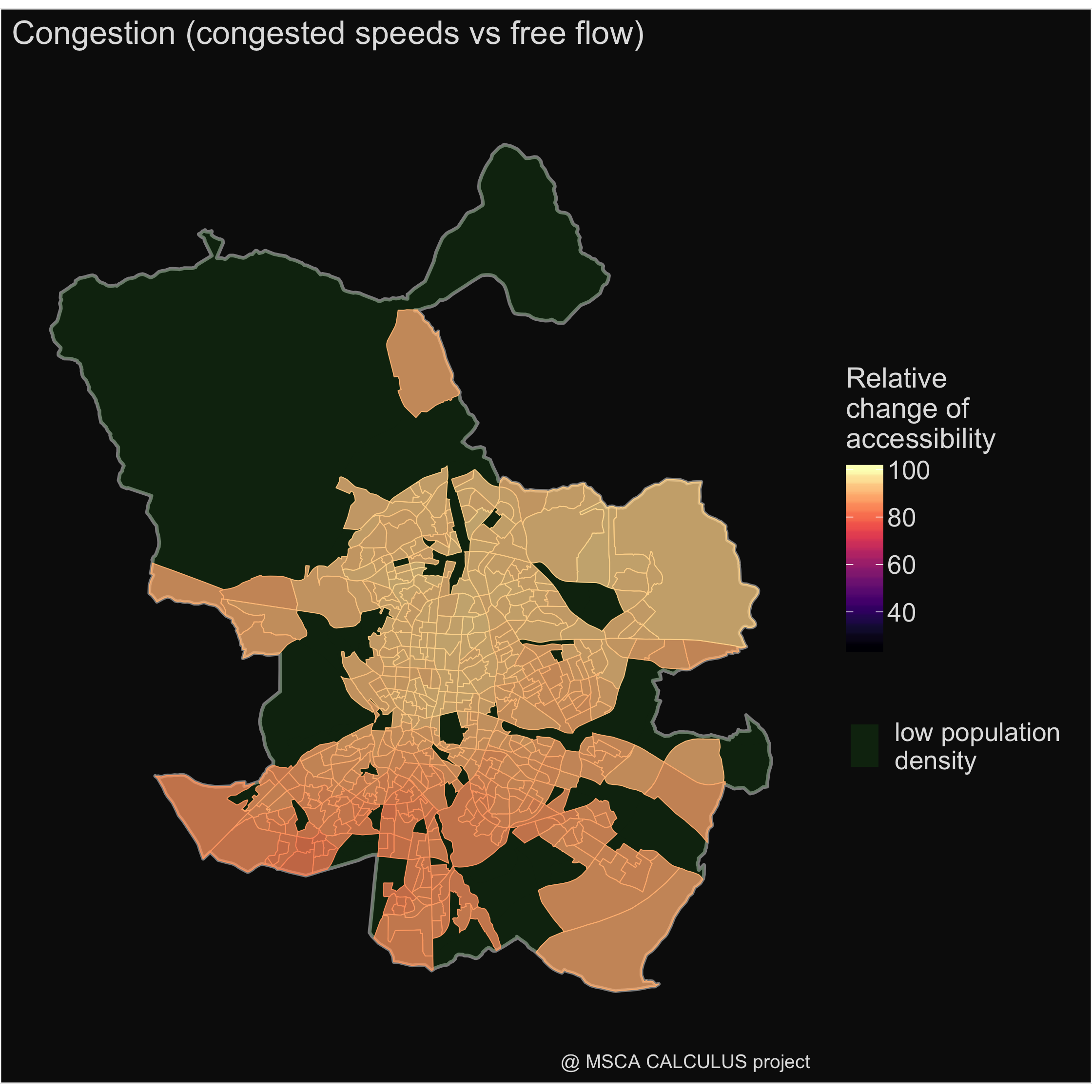
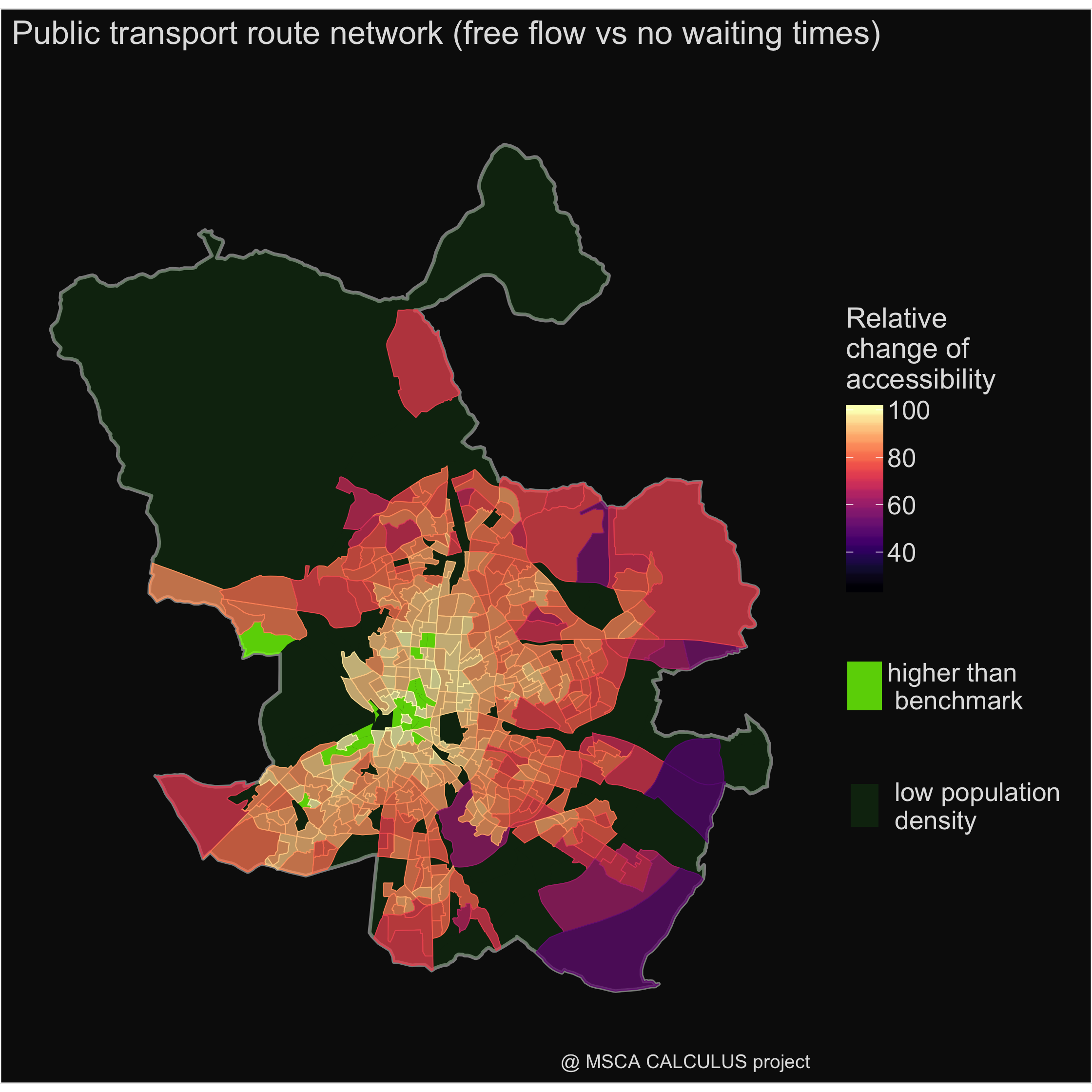
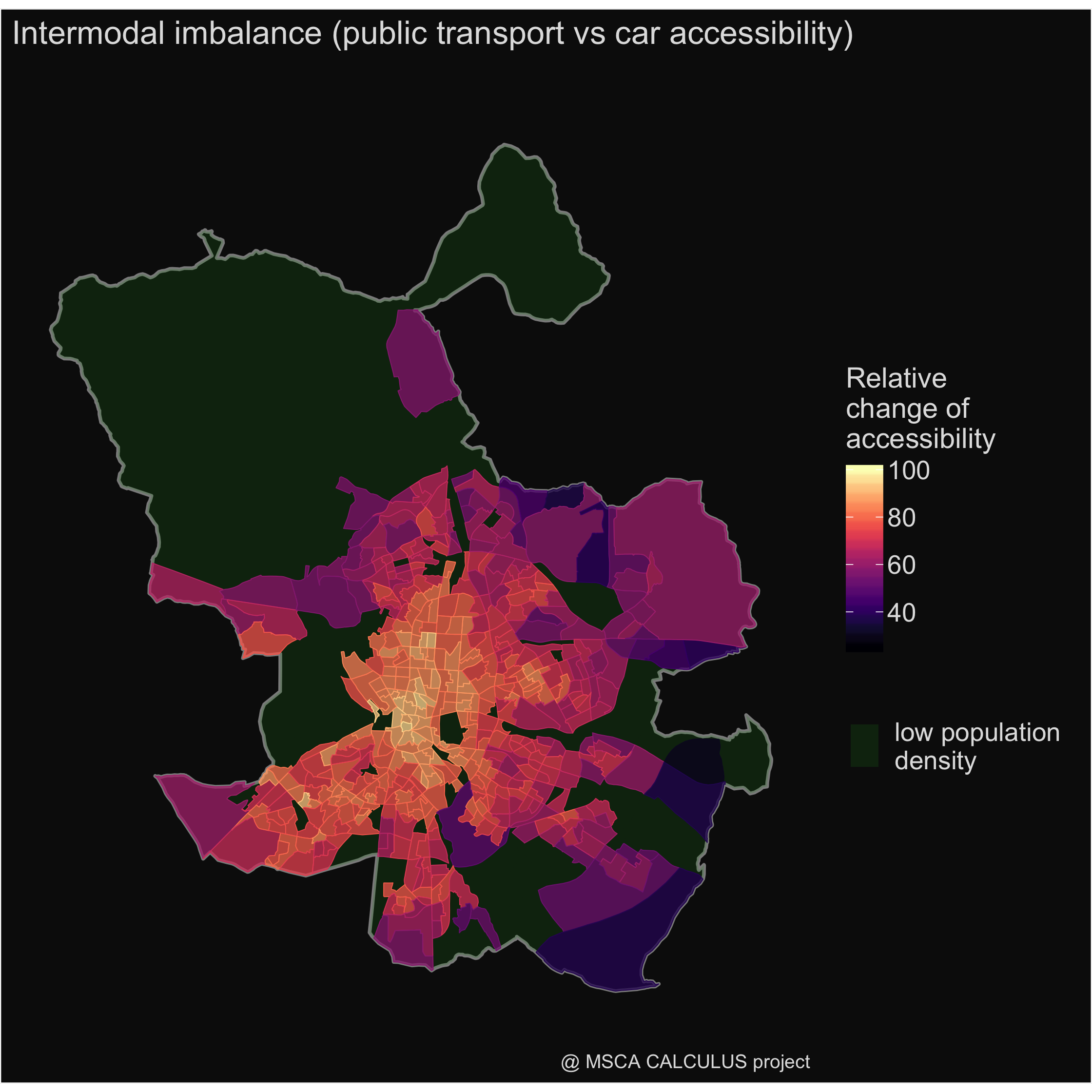
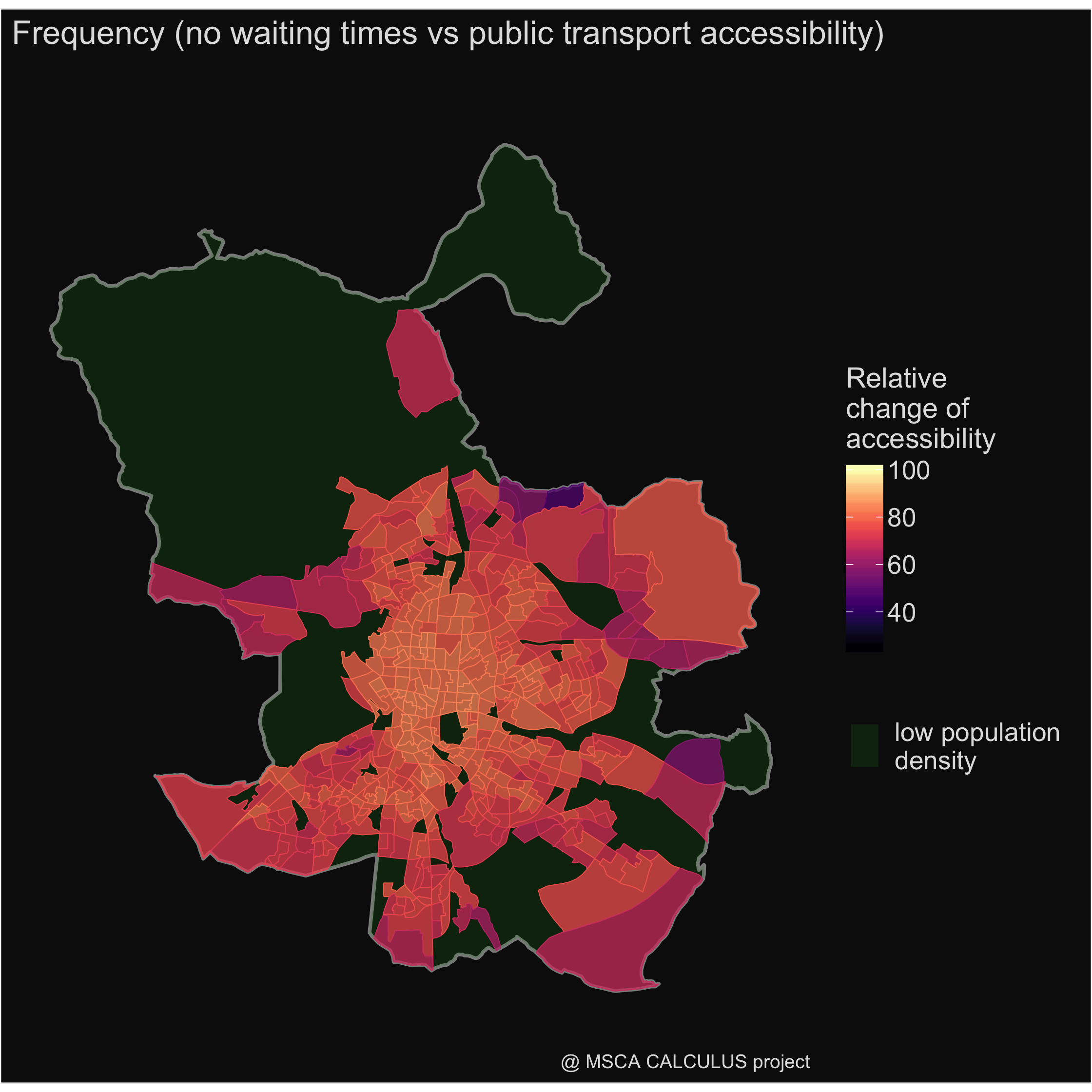
This section focuses on spatial pattern of impact of particular accessibility restrictions. The title of a particular map indicates which of the two scenarios are compared against each other. The in-depth analysis enable to evaluate the extent to which a particular transport-related accessibility restriction affects inhabitants of a given zone.
| Spatial pattern of accessibility restrictions | |
|---|---|
 |
 |
 |
 |
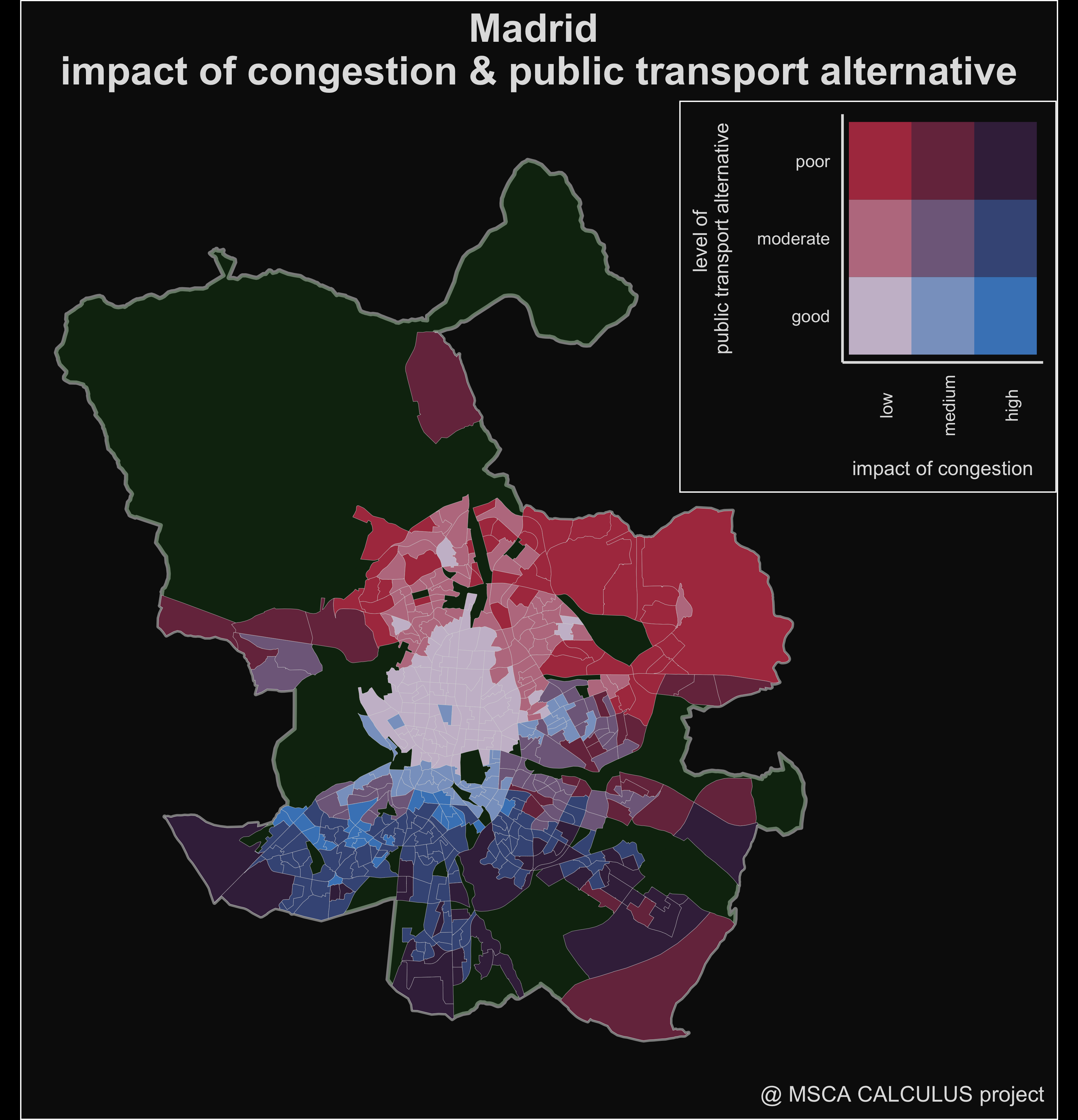
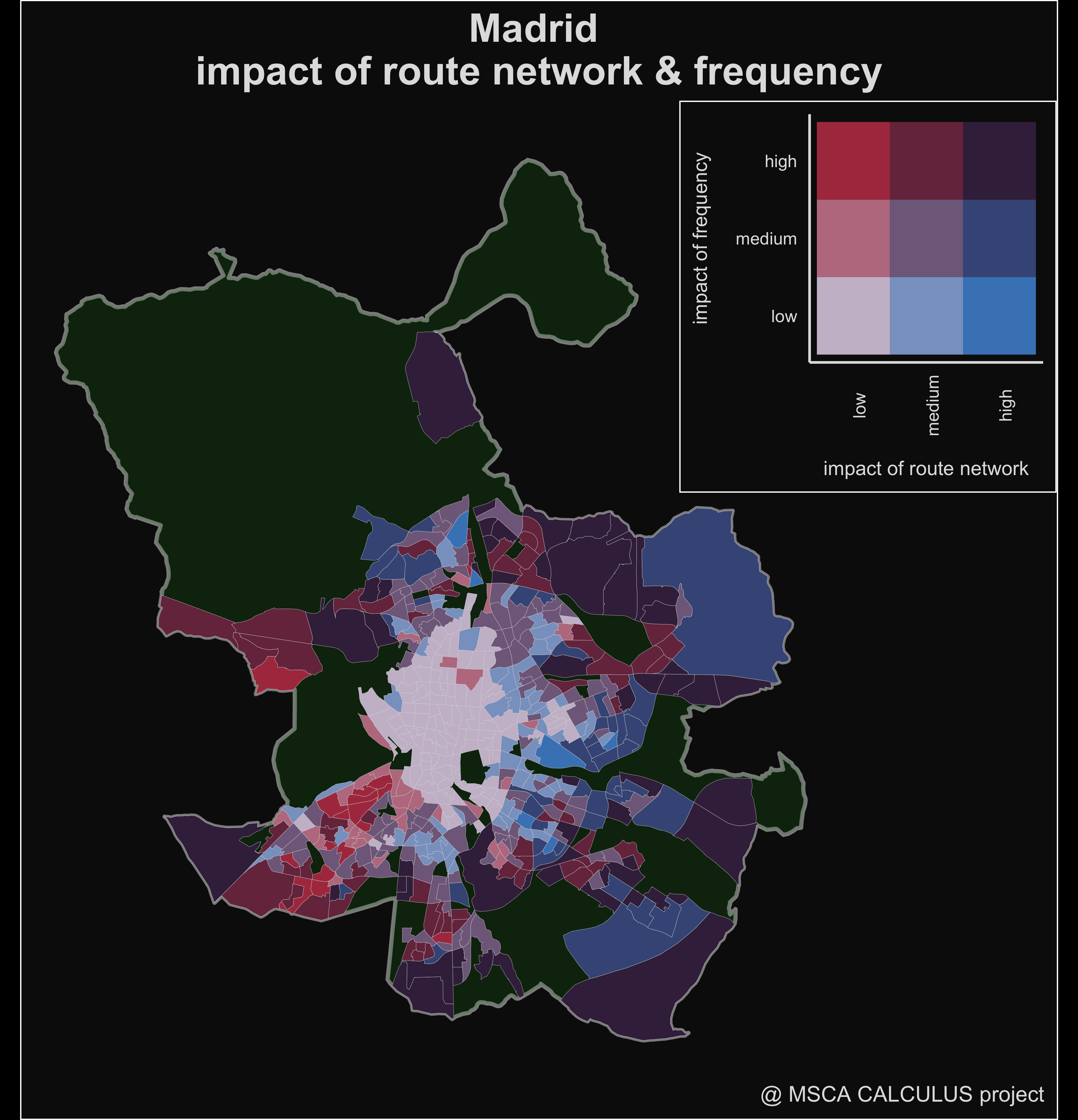
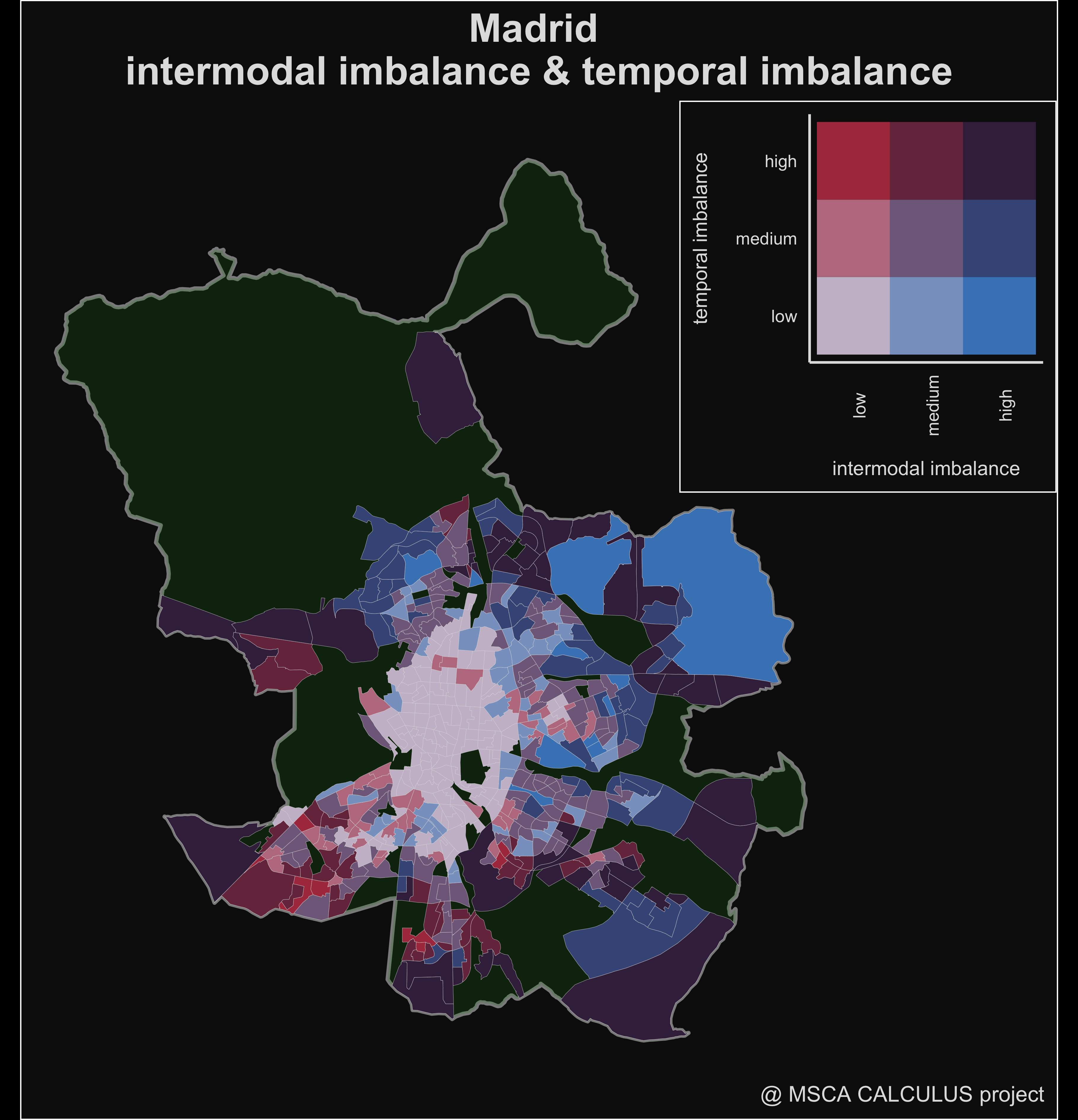
Bivariate maps
The next set of maps focuses on an evaluation of impacts of pairs of factors. As the maps presented above show a spatial pattern of impact of a particular restriction, bivariate maps puts these results in the broader context. Apart of the evaluation of a given factor, they inform what these restrictions means for inhabitants, e.g. congestion affects inhabitants in the areas with low level of accessibility by public transport to the larger extent, as people have limited alternatives other than travel in traffic jams). Using this kind of illustration facilitates to identify areas of intervention which should be addressed in the first order.
First map confronts impact of congestion and the level of accessibility by public transport. If high level of congestion affects areas with relatively efficient public transport, it may stimulate inhabitants to use public transport instead of private car, as it becomes to be more competitive. On the contrary, high level of congestion and low accessibility by public transport means that inhabitants are stuck in traffic jams because they don´t have any reasonable alternative. In this case policy makers (or transport planners) should focus on this area first.
Second map facilitates to identify how public transport can be improved: to what extent accessibility in a given area is limited due to low (insufficient) frequency or in order to improve accessibility, there is a need to reorganize a route network of public transport.
The third map analyse to what extent inhabitants of particular zones are double affected by limited accessibility by public transport, i.e. not only by low average level of accessibility by public transport, but also by the high variation in accessibility level (so to larger extent their daily schedule need to focus a public transport schedule).
Concluding remarks
The presented decision support tool facilitates an identification of the most severe restrictions of accessibility level, so transport planners and policy makers will know what they should focus on in order to improve quality of life of inhabitants of a city. It provides a general information about the most important accessibility restriction at the city level and provides a set of very detailed information about the spatial pattern of impacts of particular restrictions.
In the future, a technical note will be shared through a github repository and relevant information will be shared through project repository. At the moment, an example dataset of accessibility values used for the presented study is available throught the open data repository.
Contributors
This study was prepared in collaboration with:
- Borja Moya-Gómez (tGIS Research Group, Complutense University of Madrid)
- Juan Carlos Garcia Palomares (tGIS Research Group, Complutense University of Madrid)
- Amparo Moyano (Department of Civil Engineering, Universidad de Castilla-La Mancha)